
Food Label Design: FDA Requirements and Design Tips for Small Brands
Why food label design is different
A food label has two jobs that pull in different directions. It has to sell: catch the eye on a crowded shelf or a product listing, say what the product is and make someone want to try it. It also has to inform: carry the statements that federal rules require, in the right place and at a size people can read.
Good food label design handles both at once. The brand, color and imagery do the selling, and the required information is planned into the layout from the start rather than squeezed in at the end. This guide explains the parts of a US food label, where each required statement goes, the type size rules, allergen labeling, and the design and print steps that keep a launch on schedule. The rules come from the FDA’s Food Labeling Guide and the regulations in 21 CFR Part 101, checked as of October 2026. Pros Inc designs packaging and labels for small brands from our office in San Diego, and this is how we plan a food label before any artwork begins.
This article is a design guide, not legal advice. The FDA notes that it does not pre-approve food labels, so check your final label against the current rules or ask a food labeling specialist.
The two panels that matter
US food labeling rules are organized around two areas of the package.
The principal display panel
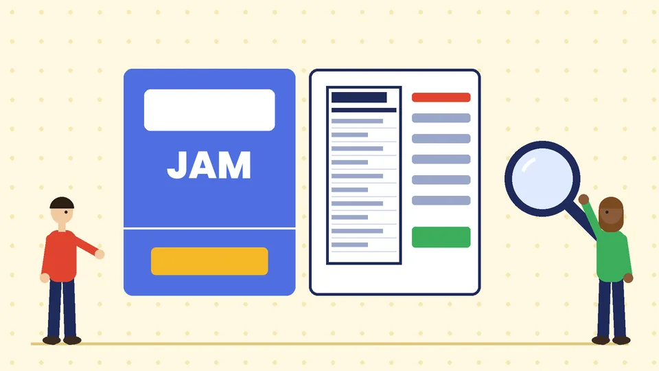
Under 21 CFR 101.1, the principal display panel, or PDP, is the part of the label most likely to be seen by shoppers under normal retail display. In practice it is the front. The regulation says it must be large enough to hold all the required information placed there with clarity and without obscuring design or crowding.
The area of the PDP matters because it sets the minimum type size for the net quantity statement. For a rectangular package, the area is the height times the width of that side. For a cylindrical container such as a jar or can, it is 40 percent of the height times the circumference.
The information panel
Under 21 CFR 101.2, the information panel is generally the panel immediately to the right of the PDP as you face it. This is where the ingredient list, the name and place of business, the Nutrition Facts label and allergen information usually go. Information on this panel must appear in one place without other material in between, and letters must generally be at least one-sixteenth of an inch tall.
What goes on the front
The statement of identity
The front must state what the food is. 21 CFR 101.3 requires the statement of identity to be one of the principal features of the PDP, in bold type, in a size reasonably related to the most prominent printed matter on the panel, and in lines generally parallel to the base of the package. The name should be the name required by regulation, or the common or usual name of the food, or a clearly descriptive term.
For designers, that means the product name cannot be a tiny line under a large brand mark. “Small Batch Strawberry Jam” can sit below a bold logo, but it must still read as one of the main things on the front.
The net quantity of contents
The net quantity statement tells shoppers how much food is in the package. According to the FDA’s Food Labeling Guide, it:
- Goes as a distinct item in the bottom 30 percent of the PDP, in lines generally parallel with the base of the container.
- Must be shown in both metric units, such as grams or milliliters, and US customary units, such as ounces or fluid ounces. For example: Net wt 1 lb 8 oz (680 g).
- Is measured by weight for solid, semisolid or viscous foods, and by fluid measure for liquids.
- Must not include the weight of the container or packing materials.
- Must not use qualifying phrases or terms that exaggerate the amount of food.
The guide also sets a minimum type size based on the area of the PDP:
| Area of principal display panel | Minimum type height |
|---|---|
| 5 square inches or less | 1/16 inch (1.6 mm) |
| More than 5 and up to 25 square inches | 1/8 inch (3.2 mm) |
| More than 25 and up to 100 square inches | 3/16 inch (4.8 mm) |
| More than 100 and up to 400 square inches | 1/4 inch (6.4 mm) |
| More than 400 square inches | 1/2 inch (12.7 mm) |
Type height is measured on the lowercase letter “o” when you use mixed upper and lowercase letters. The guide adds that letters must not be more than three times as high as they are wide, and the statement must contrast with its background and not be crowded by artwork.
What goes on the information panel
The ingredient list
21 CFR 101.4 requires ingredients to be listed by their common or usual name in descending order of predominance by weight, so the heaviest ingredient comes first. The Food Labeling Guide says the list goes on the same panel as the name and address of the manufacturer, packer or distributor, and uses type at least 1/16 inch tall. Ingredients present at 2 percent or less by weight can be grouped at the end after a statement such as “Contains 2% or less of”.
The name and place of business
21 CFR 101.5 requires the label to state the name and place of business of the manufacturer, packer or distributor. If your brand did not make the food, the name must be qualified with a phrase such as “Manufactured for” or “Distributed by”.
The Nutrition Facts label
Most packaged foods need a Nutrition Facts label. The FDA’s page on changes to the Nutrition Facts label describes the current format, which includes larger type for calories, servings per container and serving size, a required line for added sugars, and dual-column labels for some packages that could be eaten in one or several sittings. Follow the FDA’s format specifications closely rather than restyling the panel to match your brand.
Some small businesses may qualify for an exemption. The FDA’s small business nutrition labeling exemption page explains that one exemption covers low-volume products from firms with fewer than an average of 100 full-time equivalent employees selling fewer than 100,000 units of the product in the US in a year, and requires an annual notice to the FDA. Products that make nutrition claims do not qualify for that exemption. Check the current rules before you design a label without a Nutrition Facts panel.
Allergen labeling
The FDA’s food allergies page lists nine major food allergens: milk, eggs, fish, Crustacean shellfish, tree nuts, peanuts, wheat, soybeans and sesame. Sesame was added by the FASTER Act and has been covered since January 1, 2023.
The label must declare the food source of each major allergen at least once, in one of two ways:
- In the ingredient list, in parentheses after the ingredient name, such as “whey (milk)” or “flour (wheat)”.
- In a “Contains” statement immediately after or next to the ingredient list, such as “Contains: milk, wheat.”
The specific type of tree nut and the species of fish or Crustacean shellfish must be named. Statements such as “may contain” are voluntary, and the FDA says they must be truthful and not misleading and should not replace good manufacturing practices.

Design tips that keep labels compliant and attractive
Plan the hierarchy before the artwork
Decide the order of attention on the front: brand, product name, key flavor or benefit, then net quantity at the bottom. Sketch it at actual size. A layout that works on a large screen can fail at the real 3-inch width of a jar label.
Keep artwork away from required statements
The Food Labeling Guide says not to use artwork that hides or detracts from required statements or misrepresents the food. Leave clear space around the net quantity statement and the ingredient list.
Choose readable type for small text
Use a simple, open typeface for ingredients and allergen statements, with strong contrast. Light gray text on a colored background, condensed fonts and reversed-out text on busy images are common reasons labels are hard to read.
Match imagery to the product
The Food Labeling Guide gives the example of juice labels, where pictures of fruit can create an expectation about what the product contains. Show what is actually in the package.
Check foreign language rules
If you use another language anywhere on the label, the Food Labeling Guide says all required statements must appear in both English and that language.
Add your barcode early
If you plan to sell through stores, plan the barcode’s size and position at the start rather than fitting it in at the end. Our guide to getting a UPC bar code explains how barcodes work.
From design to print
Labels are printed products, so the file preparation matters as much as the design:
- Get the die line from your printer with the exact label size, shape and bleed.
- Measure the PDP area on the real package to set the net quantity type size.
- Design at full size and print test copies to check readability.
- Prepare print-ready files with correct color settings, bleed and outlined fonts. Our commercial printing guidelines cover the details.
- Proof every word, especially the ingredient list, allergen statement and net quantity.
- Approve a printed proof before the full run.
If your product also ships to customers who buy online, the outer packaging needs its own plan. Our guide to ecommerce packaging design covers mailers, boxes and the unboxing experience, and our overview of the packaging design process explains how packaging projects are usually run.
Frequently asked questions
What information is required on a food label?
Where does the net weight go on a food label?
What is the minimum font size on a food label?
What are the major food allergens that must be labeled?
Does the FDA approve food labels before they are printed?
Do small food businesses need a Nutrition Facts label?
Work with Pros Inc
Pros Inc designs food labels and packaging that sell on the shelf and carry the required information clearly. To talk about your product, contact us at 715 J St #200, San Diego, CA 92101, or call (858) 652-8920.